

Tell Us About Your Favorite Dashboard!
One of the recent water cooler conversations around the Mozplex has been about dashboards. The question: What makes a great dashboard? We all use these top-level reports in various apps everyday, for professional and personal reasons, and some are better than others.
At their best, these reports can do an amazing job of making our work more efficient. You check the dashboard, review your progress, gather some insights, and know what to do next. Etta James cues up, the clouds part, sunshine beams down on your desk, and a unicorn gallops in slow motion past your office window.
But at their worst, dashboards are lacking in useful info, cluttered, or convoluted. They amount to one more click between you and the real details you need in an app, adding to the clown-car cycle of chasing down your next actions.
So we put the question to you...
What dashboards give you your “At Last” moment? Or are at least useful? What features on those dashboards are the most useful?
Take moment and fill out this survey and share your thoughts.
To get you thinking about this, here are some some favorites from Mozzers, in no particular order:
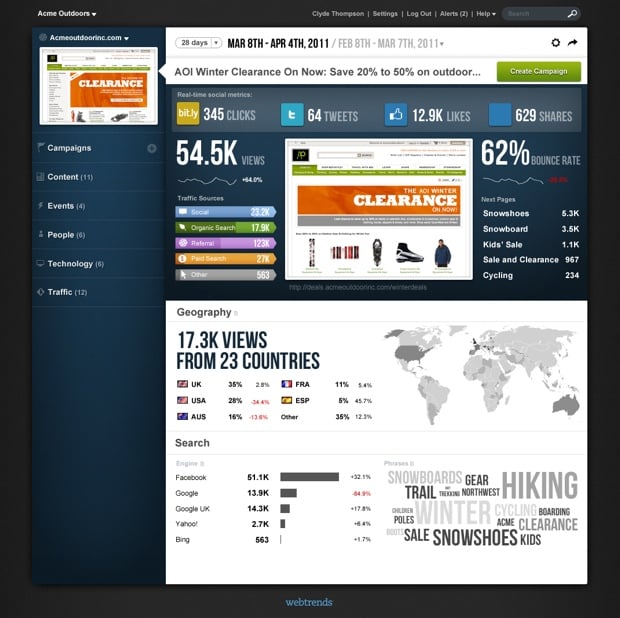
WebTrends
Rand says: Beautiful UI/UX, fun to look at, colorful, bleeding edge.
Miranda says: Clean design, interesting use of typography, and nice supporting visuals.
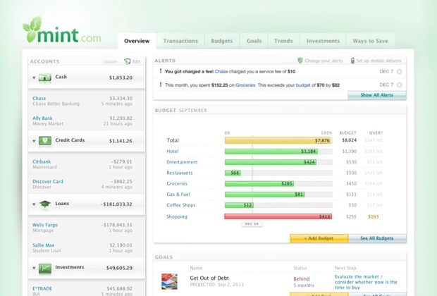
Mint
Courtney says: It’s super detailed and yet, I know what to do what to do at first glance. The yellow, green, red indicators show my progress and warn me when I’m approaching or over budget. Alerts at the top of the page provide insights into how I’m doing and what I can do better. Goals provide easy benchmarking. This holistic view paints the entire picture in a way that is easy to digest and suggests actions, and I love that I can dig deeper into any of these topics with a single click (or two).
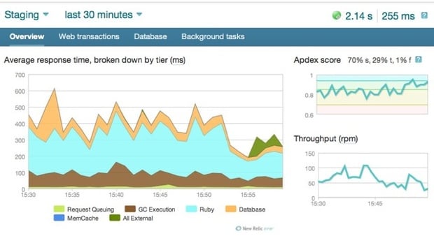
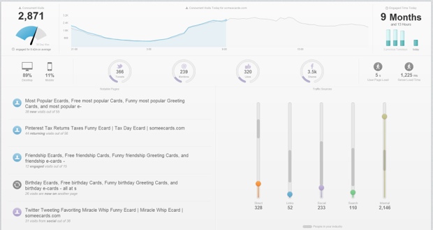
New Relic
Thomas says: I get quick access to recent over-time data for the most important metric in a way that can be dissected easily. A statistical score for most important metrics, plus traffic. You can change the timeframe quickly. They provide alerts, have nice use of color, and use consistent help-hovers.
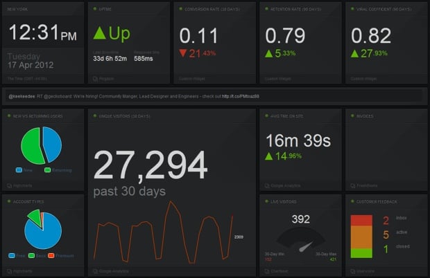
GeckoBoard
Adam says: It’s perhaps not the most beautiful dashboard, but it’s broadly customizable. There’s something to be said for a big bold dashboard that shows off your key daily metrics in big bold type.
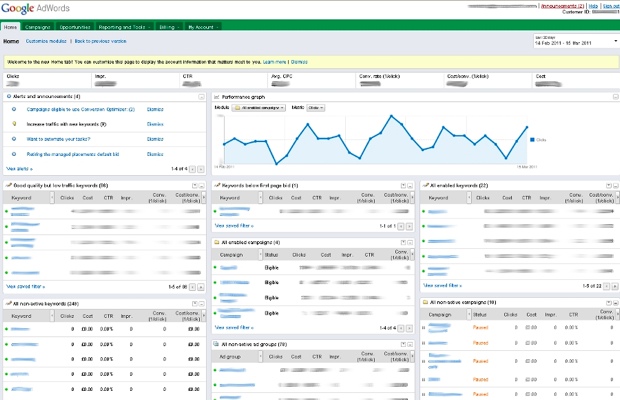
Joanna says: For me a dashboard needs to both summarize the movement of my data but also suggest a next step. I think Adwords does a solid job, but I also find that paid marketing platforms in general do a great job of surfacing the changes I should prioritize investigating. For me its all about summarizing and prioritizing...and it being pretty of course. Give me all that and I'm not going anywhere.
WordPress
Rand says: It gets me all the info I need, and it’s customizable.

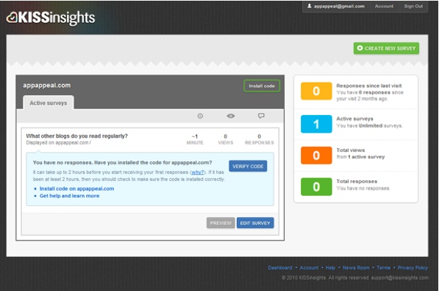
KISSInsights
Joanna says: KISSInsights has test summaries and important info, all laid out very digestibly.
More favorites include:
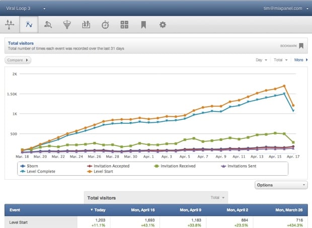
Mixpanel
SimplyMeasured
Chartbeat
Please share your favorites with us!


Comments
Please keep your comments TAGFEE by following the community etiquette
Comments are closed. Got a burning question? Head to our Q&A section to start a new conversation.